
3 Social media accessibility tips to improve your content
This blog is written by Pelumi Adekunle, our Social Media Intern from the University of Sussex, with a passion for social justice.
It’s safe to assume that everybody is familiar with the term accessibility and its day-to-day use. We don’t think twice about why there are wheelchair ramps on buses and trains, or why there are automatic doors and lifts in commercial buildings. It’s all an attempt to make society more accessible for those who may struggle otherwise.
Accessibility shouldn’t only be present in the physical world; it must be extended to digital spaces too. Otherwise, we deny access to online information and services to those who may need it the most.
Whilst social media has aided in increasing accessibility in a multitude of ways, like removing physical barriers to products and services, we still have a long way to go.
This post will provide some insight into how you can make your organisation’s social media more accessible.
So, What Is Social Media Accessibility?
Social media accessibility is the practice of developing content that everyone can perceive, understand, and engage with. Disability encompasses more than just physical disability, It also covers visual, auditory and cognitive impairments. It’s important social media posts are accessible for everyone. From an organisation’s perspective, it helps to expand the audience, reach, and engagement. But most importantly, social media being accessible ensures that digital citizens aren’t excluded from online spaces, in an increasingly digital world.
Accessibility features also benefit non-disabled communities. For example, captions can help non-native speakers understand a video.
3 Ways To Make Your Organisation More Accessible
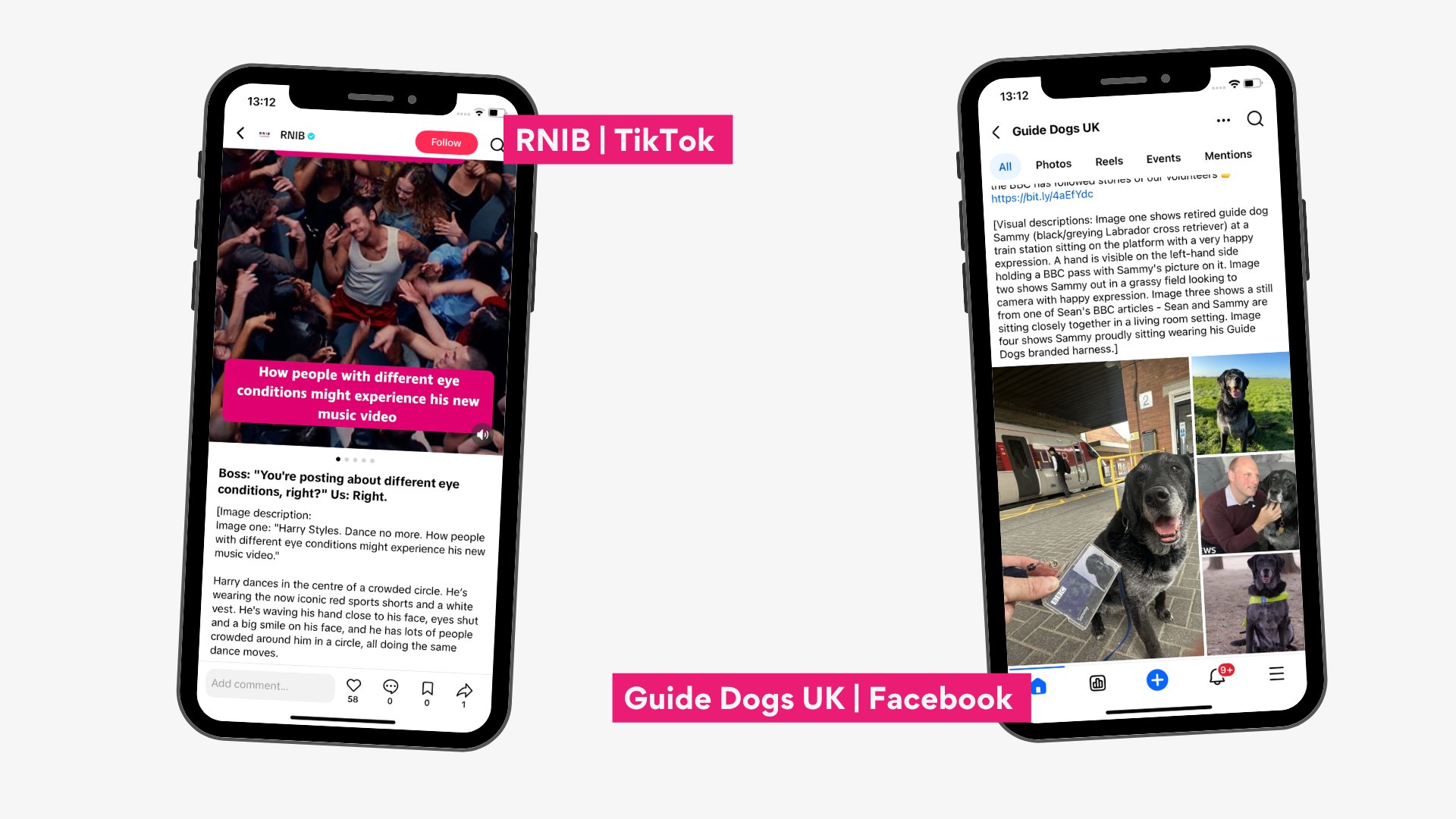
Alt Text
Alt Text is a brief description of an image or graphic in digital content, like social media posts.
It is typically read aloud by assistive technology (e.g. screen readers) used by people with visual impairments. This helps them understand what the image/graphic is and get the full context of the post.
Remember Alt text should be kept concise for maximum impact!
Keep it concise
Use punctuation sparingly for clarity
Stick to describing the core information (e.g. text in the graphic). Avoid unnecessary detail (e.g. shade of colour)
Don’t repeat information that’s elsewhere (e.g. in the caption)
Captions
Captions are text overlay on videos that transcribe spoken dialogue and sound effects. This allows deaf or hard-of-hearing individuals to access audiovisual content.
It should be noted that captions are different from subtitles, which typically transcribe spoken dialogue only. Captions go that step further, by assuming the viewer cannot hear the audio, they transcribe both spoken words and important non-speech sounds like music, laughter, and sound effects
Captions are beneficial for everyone. Up to 80% of people prefer to browse content with the sound turned off!
If you want your organisation's social media to be accessible, captions are not one to skip.
Maximum 2 lines per frame
Make sure a caption is visible for at least 2 seconds
Double-check accuracy of auto-generated captions
Add a colour border to captions so they’re easily seen
Make sure captions are on screen for at least two seconds for maximum clarity.
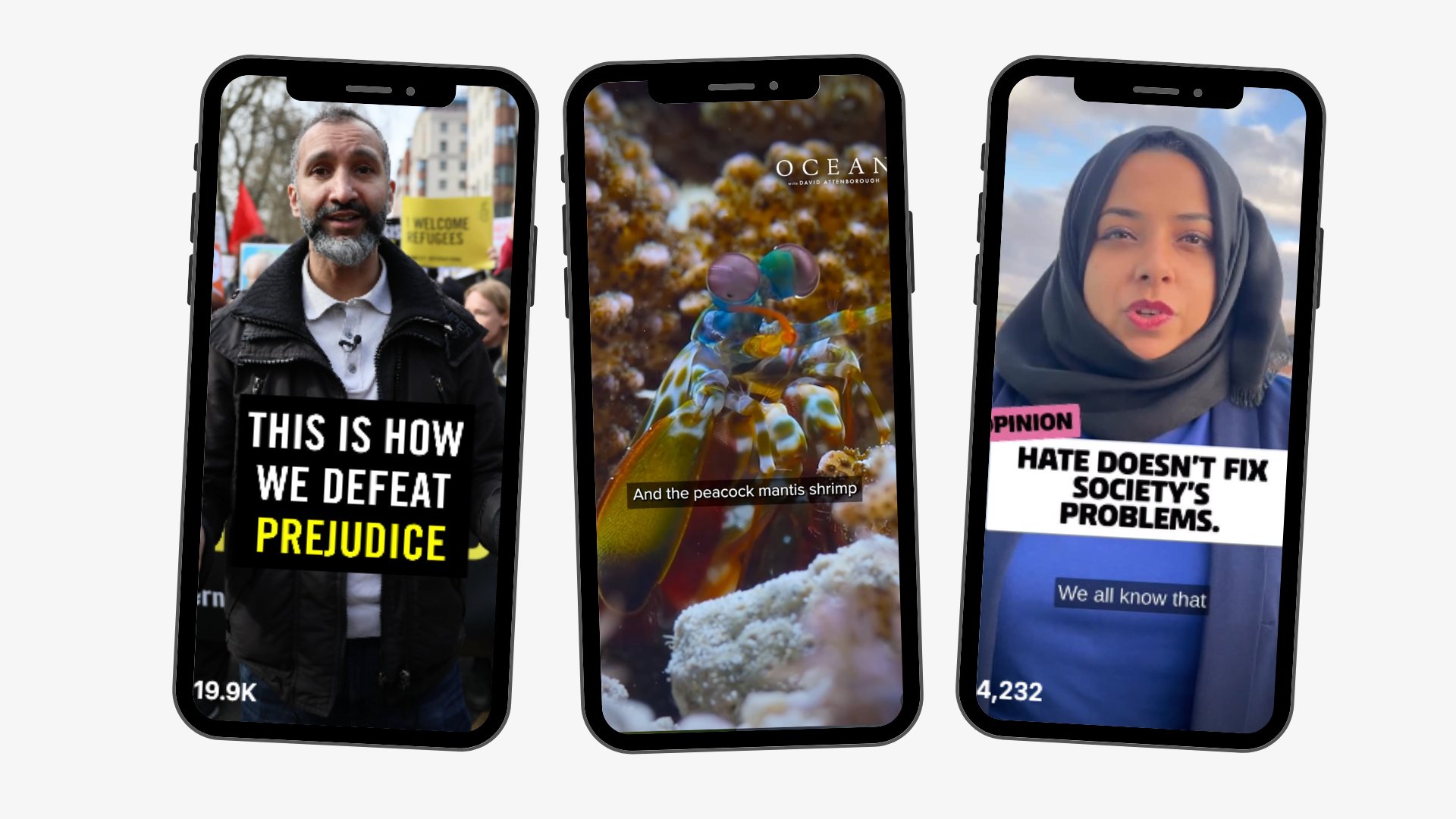
Include video captions with good text size and contrast.
Text size & contrast
Text size and colour contrast affect what is and isn’t legible.
This may seem simple, but it’s one of the most underrated ways to make your posts more accessible.
Text size is often missed because text that is legible on a larger sized laptop or computer screen, may lose this once it's been scaled down to a smaller sized phone or tablet screen. To ensure content is accessible, it must be clear on all screen sizes.
Text size is particularly impactful for people with visual impairments, learning disabilities (like dyslexia), and cognitive impairments. It’s a simple change, with a sizeable impact!
Use https://colourcontrast.cc/ to check your brand colours.
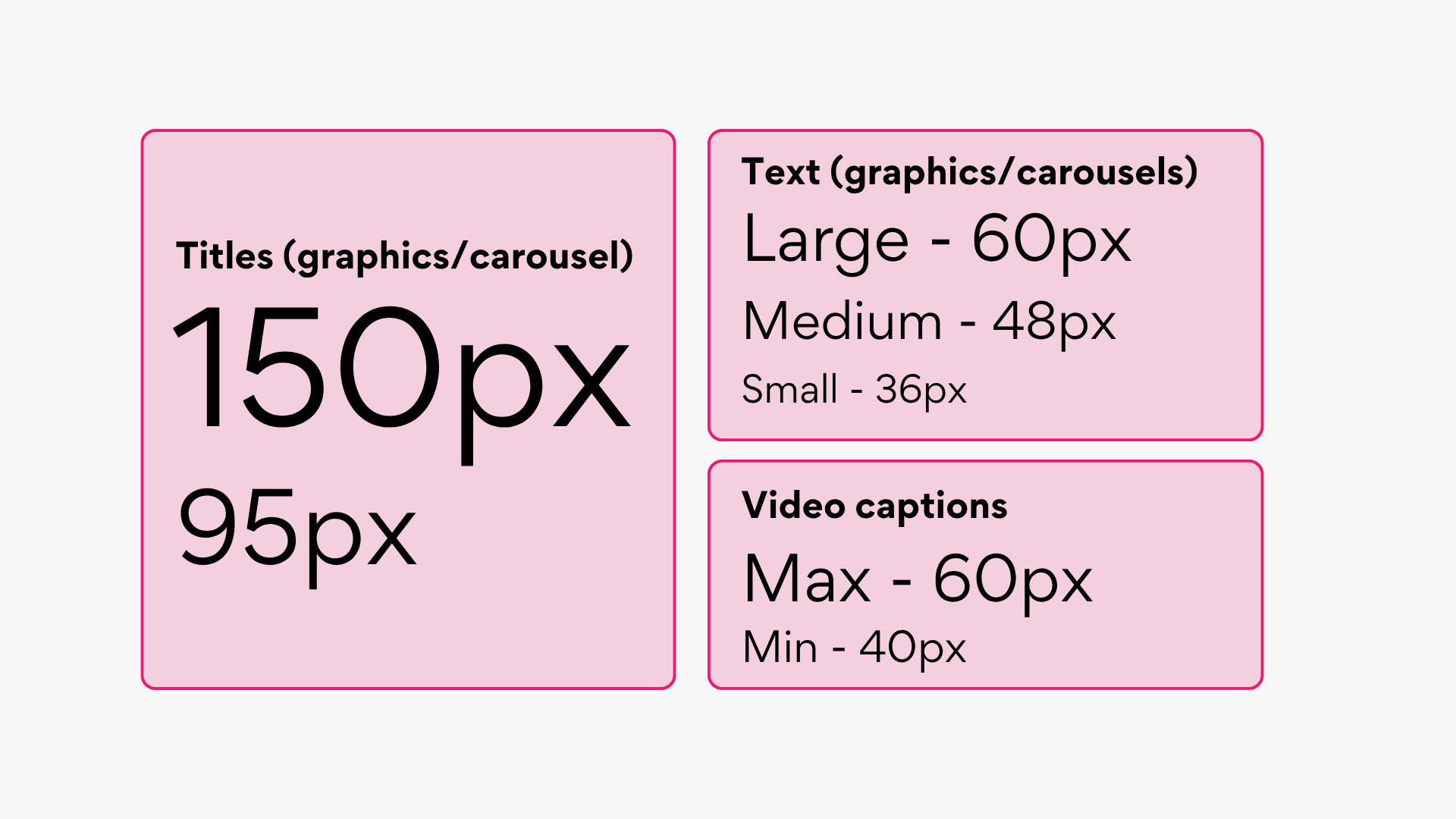
Guidance on text size
More resources
For more information, help, or useful tips on accessibility, check out our webinar, hosted by our social media manager & strategist, Ramin Gurung.
The Royal National Institute of Blind People and the Web Accessibility Initiative have some great advice on making your organisation more accessible.
As purpose driven organisations, it’s important that we make our content accessible for all. Whether that be adding alt text, video captions, or simply making the text size larger or contrast stronger, there are easy ways to adapt our content so that everyone can access and enjoy it.